Website case study · Framer
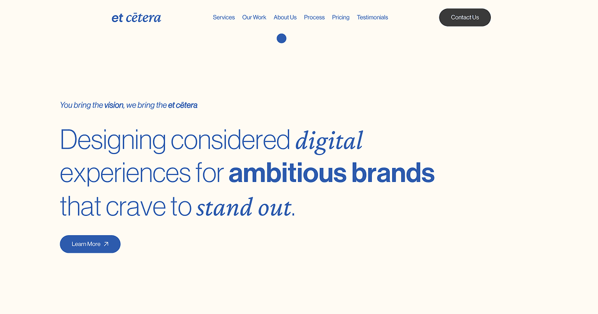
A restrained editorial website for an ambitious digital studio.
The brief
Expressing a design-led point of view without complicating the experience.
Etcetera needed a website that could express a design-led point of view without making the experience feel complicated. The structure had to keep the studio’s services, work and positioning clear while leaving room for confident typography and motion.
The approach
A clear path from first decisions to final delivery.
- 01
Built the page hierarchy around a concise studio narrative and direct routes into services and work.
- 02
Used typography, generous space and a focused colour system to create a recognisable visual identity.
- 03
Translated the approved direction into a responsive Framer build that remains easy to manage.
03 · The outcome
A clear platform for the studio’s capabilities and creative point of view.
The finished website gives Etcetera a polished platform for presenting its capabilities, selected work and creative positioning in one coherent experience.